Brand New Brand Baby!
There's probably no better brief for a designer than to develop a new brand for someone.
Starting from scratch with a blank canvass can be a challenge but given time with the right research, superb things will emerge from the page.
We like to start with the clients brief, do some market research & get inside the heads of their audience. Then, if the client has some preconceived thoughts on what they might like or a particular colour pallet we'll start there to bring their ideas to life. The fun part though, is throwing in a curve ball & opening their eyes to other ideas that could work & the sweetest thing of all - they run with our idea!!
Tu dah! Give us a shout if you need some help with your branding but be sure to check out some examples of what we've created at the F*King HQ below.
Woodstock Legal Services Logo
As victims of their own success, Woodstock started life as a law firm specialising in the property sector (Woodstock Property Services) gradually refining their approach to how a law form should not only present itself but operate too they quickly attracted different consultants from more diverse areas of law and so Woodstock Legal Services was born.
Our job was to rebrand the business without loosing the look their loyal customers had become accustomed to. With that, the 'W' became more of an icon that filtered down to cool angled shapes in their printed media and website graphics.
Kickback Shoes Logo Design
Wow, this one play's close to our hearts. Not only do we love what we created here for Kickback but to work alongside such a great product and having a hand in the development process makes us super-proud. There's nothing better than seeing our work on a physical product.
If you haven't checked out the Kickback range yet, you really should - your feet need these in their life!
Cater Bitz Logo Design
The Songwriting Academy
The Songwriting Academy had an existing logo but they wanted to bring their website up to speed with a more modern look and easy to use interface. We stepped in to help with the website design, and their new logo.
Again, we loved working on this one and hopefully it shows in the finished result!
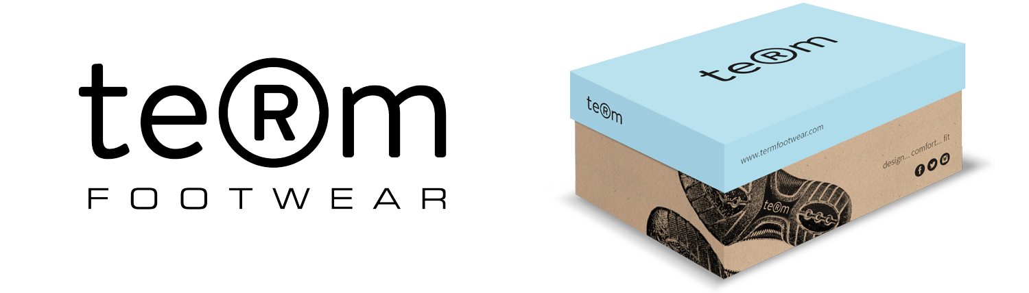
Term School Shoes Branding
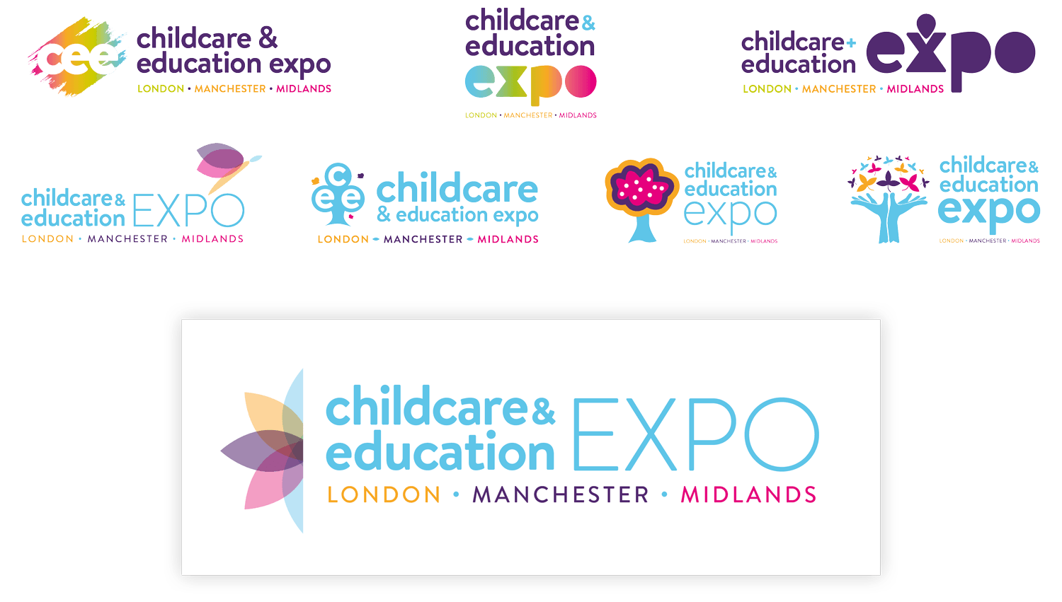
Childcare & Education Expo Logo Rebrand
Henderson Bearings Logo Rebrand
Can you do me a logo..?
Sure can, hit us up with an email or we could meet for coffee / beer if that takes your fancy, & get cracking on some new ideas for your new logo or brand!